by Herb A. Lightman & Richard Patterson
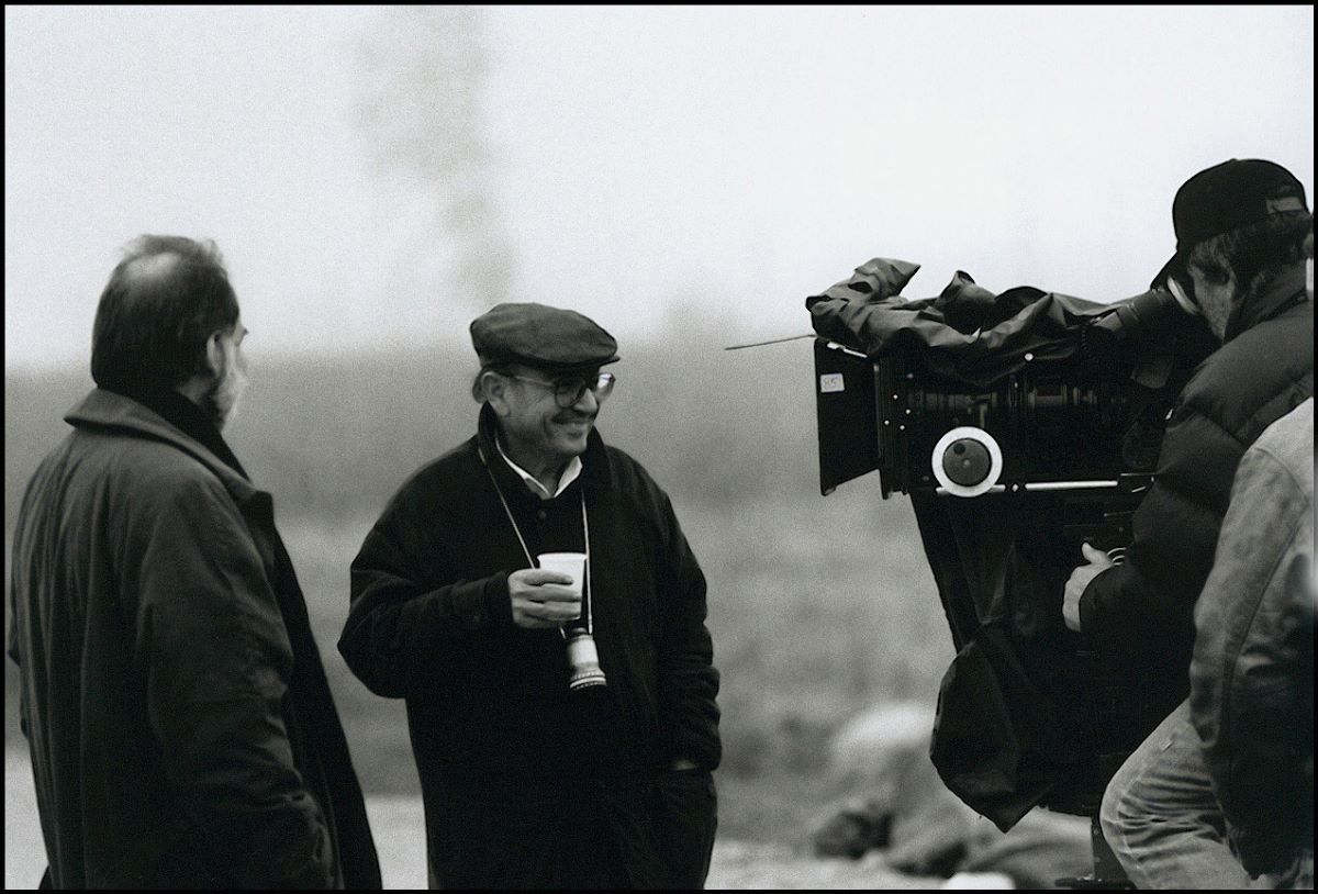
“Films usually attempt to do the future by presenting a rather bleak, pristine, austere, clean look. It could go that way, but I’ve got a feeling it’s going to go the other way.” Ridley Scott is discussing his approach in directing Blade Runner, a detective thriller set forty or fifty years in the future. “Think of Chicago or New York City right now, the over-saturation, how impossible it is to maintain some of these buildings. Think how expensive it’s going to be to take down the Empire State Building. It will cost as much as building it. Eventually, you’ll just have to ‘retrofit’ things on the face of the building rather than having to pull half the side off, re-house the air conditioning or re-wire it. The cost will get so high it’s going to be simpler just to smack things on the outside. So maybe buildings will start to be designed from the inside out. You wear your guts on the outside. That gives us a picture of a textured city.”
Syd Mead, an industrial designer who was the “visual futurist” for Blade Runner, describes the sociological assumptions behind the production design: “The consumer delivery system has sort of broken down. The available capital is all going to research and development and the consumer base is being neglected.” The story for Blade Runner is based on the idea that overpopulation has forced millions of people to migrate to “off-world” colonies, and that genetically engineered human “replicants” are used as laborers in “off- world” military industrial or mining operations. The result is that the urban environment on earth is a strange mixture of new technology and old elements adapted to the new conditions. As Mead puts it: “Ridley wanted things to look like they had to be jacked up a little bit to work at all —a panel refitted here, a larger unit clapped on because the old one didn’t work, that kind of accumulative accretion look.”
The extent to which the economy no longer benefits the consumer is perhaps most noticeable in the streets of the city conceived for the film. Mead, who was originally hired to design vehicles for the film, began doing sketches of the streets as settings for the vehicles and gradually became involved in visualizing a great deal of the environment for the action in Blade Runner. He recalls the concept developed for the city: “First of all you had this incredible congestion at street level. The streets had become like the underground sewers of Paris or the leftover space as you built higher and higher. I made a sketch of the typical new city where we had the World Trade Tower size building which is now old and the new buildings going up past 3000 feet high. Then you start to build an entire elevated network of connections because decent people don’t live below 60 stories above the ground. So the street level becomes an access corridor and really nothing more. If you are forced to live there by economic accident or whatever, it’s a very unpleasant place to be. You get this congestion of cars and big machines that are just there. They are owned by the city, and they just sit there for a month. People are camping under them, and there is a Hong Kong or Calcutta kind of density that Ridley was after. The Oriental graphics on the streets contribute to that density without being as distracting as English language signs would be for an American audience. They give you the visual crowd and the add-on visual jumble without too much distraction. I had noticed that myself in Tokyo on the Ginza where the signs look incredibly jumbled, but I was not distracted by being able to read them so I could enjoy the pure visual composite they created.”
The other extreme in the city is represented by the 700-story pyramid housing the offices of the Tyrell Corporation responsible for the creation of the replicants. Production designer Lawrence Pauli describes the executive office at the top of the pyramid as “Establishment Gothic.” It has black marble floors, 20-foot columns, a black marble desk and a huge picture window overlooking the entire city.
Although Blade Runner involves a vision of the future and a conception of the impact of genetic engineering, Scott is quick to point out that it is not a “serious” picture, and the production design reflects this basic attitude towards the story. “The film is a tongue- in-cheek idea of what could actually happen if the replicant industry becomes a large conglomerate, a monopoly. If one particular company could become so large that it develops into aerospace, it develops into the space probes looking for mining and military areas. Another side of that company could be genetics and genetic engineering which could easily lead to the development of the first human clone.” “To do a film like this you can choose to go in one of two directions. You can choose to do a film which is about genetics and genetic engineering, which is a very serious subject. A genetic explosion is happening right now. If it develops in the way that science has progressed since the turn of the century through the 80’s, then we’re going to see all sorts of things affected, probably to the good. But we decided not to do that kind of movie. We decided to use certain broad elements from that kind of situation and create a kind of comic strip; so this film is not too serious. It’s not a film about genetics. It touches on it, but it isn’t about it. The story situation has arisen because of it.
“Also this film is not a warning in any sense of the word. At the moment I choose not to do films which are loaded in that way. This film is, hopefully, good fun. The films that have fascinated me the most in the last couple of years tend to have been films which are derived from comic strips. I’ve chosen to go in that direction, and therefore there is a lot of broad strokes, fast bold action, and colorful characters.”
Syd Mead also makes it clear that the film is not intended to be a realistic vision of the future: “I was hired as a consultant to produce exactly what they wanted for that story, for Ridley’s visualization. The next movie that I’m hired to work on might involve a vision of the future that is slick or marvelous or has a slight kink in the whole framework so it looks a certain way, but I’ll do that just as deliberately. It has nothing to do with my own personal view of the future.” Work on the design for vehicles and settings for Blade Runner began very early while the script was being developed, partially because of Scott’s own background. “I was a designer, trained as a painter, then an art director, and then from art direction drifted into graphic design. Graphic design opens up all sorts of things because it’s photography, film and editing. Scott relies on his drawing ability to communicate his ideas when he is preparing a film. According to David Dryer, one of the special photographic effects supervisors for the film, “Ridley is such a good artist that you sit down and have a meeting with him and he draws it more than he says it.” Syd Mead also found Scott’s ability to draw very helpful: “The nice thing about working with Ridley is that he is an accomplished artist himself. He draws very well and enjoys drawing. He could do a line sketch mood pen drawing, and I could build on that with a discussion. As a result we hit most of our design visualizations within two or three tries, and a lot of them on the first try.” Scott comments, “One picture is worth a thousand words, you know—even one scribble, one sketch. I spent a long time training so I can draw very specifically. I find it’s more productive than an in- depth two-hour conference.”
Scott did some of the preliminary storyboarding for the film himself and then had a team of three production illustrators working on the film: Sherman Labby, Mentor Huebner, and Tom Southwell. In addition Scott derives a lot of ideas from illustrators and designers working outside the film industry.
“I always spend a great deal of time building a library of weird and wonderful illustrators. That’s usually where I begin a project. It began haphazardly, but I found myself totally enthralled with this unusual world, and that’s led me in the path of collecting odd illustrators, odd pictorial references to things. So I try to dig out those individuals first and that becomes, along with the development of the script, the design side of the film.”
With Blade Runner he enlisted Syd Mead, who had recently published a book of illustrations and who had worked as a design consultant briefly on Star Trek-The Movie in addition to being an internationally renowned industrial designer. Scott believes that the best place to start in designing a futuristic picture is with designers working in industry. He will commission drawings and then adapt them to his own purposes with the film. With Mead he began by commissioning designs for five or six vehicle types.
One of the vehicles was the “Spinner,” a kind of flying car that can hover or fly at speeds up to 300 or 400 mph. Mead describes the evolution of the design for the Spinner: “My first comment to Ridley, when he asked what it should look like, was ‘It should be something other than a rotating blade or helicopter or folding wings. That’s been seen in Popular Mechanics for probably 20 years.’ I said, ‘Why don’t we do a very clean, all enclosed vehicle that’s a car that really does fly.’ He liked that idea, so I started designing it using the aerodyne principle of an enclosed lift.” Using what is basically a valid aerodynamic principle and assuming certain technological advances yet to be made, Mead designed a vehicle which could seem plausible. The look of the vehicle was based on a concept of how it would actually work. “We were proposing for the Spinner—as a technological supposed base—that you have turbines inside the car and you vent the exhaust down to the back and to the forward part of the car just to balance it on its center of gravity. So it looks believable. There are fans underneath, and the rain and the dust blow and it lifts off the ground.” The element of believability was a key factor in the design of vehicles and artifacts for the film. “The difficult part of designing for a film is that you have to use audience in-head memory. People will believe something is real only if it is done right and compared to what they think it should be. The big difference between designing commercial products and designing for movies is the large concession you have to make in films simply to what people will probably believe is a valid rational object for the time frame you are shooting for. And I don’t think you can really make a firm rule about it. I think it has to be guess work right up to the time people march into the theater. With a commercial product, a company invents a new object, they advertise it and the public can buy it so it becomes real. It may look completely different than anybody would have expected it to, but it is real. It is on the shelf, and they buy it; and they have to believe it for that reason. In a movie, if you tell people you are 100 years in the future and people are still walking around with shirts and ties and a funny kind of 5-wheel bicycle, you have to work to make that look believable. Otherwise they will laugh. They won’t believe that the car can fly. You have to make it look believable, and you have to use the in-head memory. I learned that a little bit just by working with corporations trying to merchandise stuff, because they’ll do pilot tests. For example when they tried to introduce movie cameras that had flat stacked reels, people didn’t believe they would work.”
Each vehicle was designed to conform both to the overall sociological concept and tailored for the specific character who owned it. “I started off with clean concepts, as I normally would for a commercial client. Then we worked out a sociological reason for the look of the movie and the things almost started to build themselves. For instance you’d start with the air pollution and you’d say, ‘If that’s true, then they would probably have to have bigger air conditioning units.’ The original car didn’t have that so you get a big lump on top. More congested traffic and you get bigger bumpers, and you add light packages on top of the trunk so you can see them better.”
“For Sebastian’s truck, we figured he was a tinkerer who had gotten a commercial chassis and covered it. In the original script he was an electronic pet doctor and he hauls electronic pets around in his van. He needed a closed van, so we patched together a truck that he would have built 40 years from now. He might have gone to a junk yard, so we said, ‘What’s in a junk yard 40 years from now?’ We thought up odd shaped plates and molded pieces that he might have picked up from a junk dealer and welded together with neoprene or some odd kind of glue. The truck has that odd beetle shaped back to it because it has all those plates glued together.”
Once Mead had worked out the concept for a design of a vehicle or object or setting, he would do a color illustration about 10″ x 15″ in size and with enough detail not only to satisfy Scott but also to enable Lawrence Pauli and his staff to build it. He describes his role in the production as that of a “visualizer” and recalls an instructor he had in art school named Dorothea Redmond who was a visualizer for one of the studios. “She would do these quick tempura sketches so the lighting people and the director and everybody involved could sense the way the shot was going to look.”
Mead’s efforts to draw the vehicles the way they would look on the screen led to his renderings of the streets and buildings and even some interiors. In his drawings of the vehicles he began inventing reasons why the buildings in the background should look a certain way. Once it was determined that the production would be using the New York Street at the Burbank Studios (appropriately the site of so many Warner Brothers Bogart and Cagney classics), Lawrence Pauli provided Mead with photographs of the existing facades. “I made elevations and tempera sketches and started again this overlaying process of putting pipes and ductwork and signs on the buildings.”
Once these renderings were completed and the production staff began constructing the sets, Scott had Mead design some of the interior sets such as Deckard’s kitchen, bathroom and bedroom and Sebastian’s working laboratory. “Again the same theory: you had a space where somebody lived 40 years in the future, and they would have things stuck around the walls that we don’t have today. That was the problem, to invent them. What would an automatic fork cleaner look like in 40 years or something that makes food in little bunches or puts sauce on it and serves it already made. And you’d have something sitting on a counter that didn’t look like anything you’d ever seen, but it had to be a kitchen appliance.
“Ridley insisted on a kind of strange ivory color as the underlay for the kitchen. When Bakelite and the first Moderne stoves and refrigerators came out, they had this strange ivory color with chrome trim and produced a sort of Moderne Deco kind of look. And it looks particularly nasty when it’s got grease and dirt on it. It looks just really grungy, and he wanted that look. So I rented them with that ivory tone, and we ended up with this molded vacuum formed kind of look to the whole kitchen set.
Scott wanted Deckard’s apartment to look as though a bachelor lived there. For instance, as Mead puts it, “You tape something on the wall to hold something. Rather than having somebody come in and re-do the cupboard, you just put a new patch on. The bathroom was much the same. Ridley specifically wanted a pullman type bathroom, as if the owner had moved in a complete unit into an old building and just hooked everything up. That’s why it had a stainless steel look to it. In each case there was a specific visual target we were after. In the kitchen set we had some plates there we left off. I don’t know if the actual set retained that feature, but there was circuitry behind and wires hanging out with a little black end on them like they had shorted out and he just tore the whole panel out and said, ‘The hell with it.’ The whole thing had to have a messy patina as if the cleaning lady hadn’t been in since last Friday or something.”
The same approach to visualizing the future is evident in the costumes designed by Charles Knode and Michael Kaplan. Scott wanted to avoid what he calls “the diagonal zipper and silver-hair syndrome.” Dave Dryer aptly sums up the approach: “One of the principles in the design of the film is that while it is 40 years in the future, it is also 40 years in the past. So rather than having people running around in shiny suits with brilliant zippers on them, they took 40-year- old clothing styles. And it has very much a Philip Marlowe kind of detective look to it. And an Art Deco look to a lot of things.”
The production design for Blade Runner appears ultimately to have been rooted less in sociology or a vision of the future than in an appreciation for the style of the old Sam Spade/Phillip Marlowe detective genre. The starting point is the desire to create a certain aesthetic and emotional texture—the nitty-gritty, funky world of a hard-boiled private eye; and the sociology is conjured up in order to give the design a logic and consistency. This is of course completely in keeping with the script, which is a deliberate reworking of the classic detective thriller and has one foot just as firmly planted in the past as the other is in the future. And the same thing applies to the photography.
CRONENWETH’S PHOTOGRAPHY
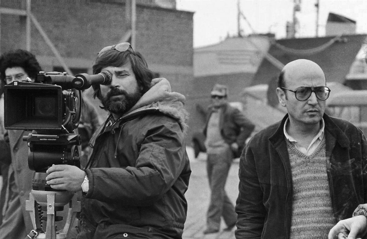
Jordan Cronenweth’s photography for Blade Runner with its strong shafts of light and use of backlighting immediately evokes images from classic black-and-white movies, and it is no accident that it does. As Cronenweth explains, “Ridley felt the style of photography in CITIZEN KANE most closely approached the look he wanted for Blade Runner. This included among other things high contrast, unusual camera angles and the use of shafts of light.”
David Dryer, one of the special effects supervisors, worked with black-and- white prints of most scenes in the film for one reason or another, and he almost wishes the film could be released in black-and-white. He thinks it seems to have even more depth and style in black- and white. Needless to say this would not do justice to Cronenweth’s work, but it is an indication of the way in which the photographic style of the film harks back to classic movies. Like every other aspect of the film Cronenweth’s photography takes the classic conventions one step further, and not the least of his tools in doing this is the use of color or even the absence of color where it might normally be expected. “We used contrast, backlight, smoke, rain and lightning to give the film its personality and moods. The streets were depicted as terribly overcrowded, giving the audience a future time frame to relate to. We had street scenes just packed with people. . . like ants. So we made them look like ants—all the same. They were all the same in the sense that they were all part of the flow. It was like going in circles. . . like going nowhere. Photographically we kept them rather colorless.”
If the people on the streets were colorless, the New York Street set was anything but: “The character and conse- – quently the lighting of the New York; Street was achieved through the use of dozens of neon signs. We rented a number of them from One From the Heart. In order to achieve a photographic reality, the on-camera neons were often on dimmers set at a level just above where they would start to flicker. At the same time the off-camera neons were used as the primary source of light whenever possible by leaving them at their brightest level. When the existing neons weren’t sufficient for either illumination or dressing, we would simply create new ones on the spot and place them wherever we wanted. An example of this was placing letters on the side and strips on the interior of a bus that Harrison runs through in one scene. At one point we had a seven-man crew doing nothing but overseeing the neon signs. There were many more neons than there were dimmers, so we had to rob Peter to pay Paul at various times.” Cronenweth would supplement the neons on occasion: “What you needed was some accent lighting to make the range stand out, to glisten the street if necessary and to highlight objects or people. Lighting the set was a simple matter of using backlight in conjunction with the ambient light.”
The neon lights were bright enough in one instance to enable Cronenweth to do some high speed photography: “In the sequence in which Harrison Ford is chasing Joanna Cassidy’s ‘Snake Lady,’ the script calls for her to run through the plate glass windows of a store. The art director built a storefront situation appropriate to the action, but when it came to dressing it Ridley was very unhappy with the first attempt. They tore all the dressing out and a week later presented a new interpretation, but he still hated it. Ridley himself finally had the wonderful idea of taking the neon signs off the New York Street set and placing them in the windows of the stores. What developed was something that really worked. We then photographed the chase with multiple cameras running at various frame rates — normal and above normal. We had to deal with a pulsing effect which doesn’t occur when photographing neons at normal camera speeds, but definitely occurs at higher frame rates. We lived with it by using the pulsing as an element of the chase.” Another striking use of colored light is the scene in the toy room where Deckard encounters Pris, one of the replicants. She is made up with white make-up, and the scene is lit with rose colored light. Colored lights were also used occasionally for the light effect in the replicants’ eyes: “One of the identifying characteristics of replicants is a strange glowing quality of the eyes. To achieve this effect, we’d use a two-way mirror—50% transmission, 50% transmission, 50% reflection —placed in front of the lens at a 45 degree angle. Then we’d project a light into the mirror so that it would be reflected into the eyes of the subject along the optical axis of the lens. Sometimes we’d use very subtle colored gels to add color to the eyes. Often we’d photograph a scene with and without this effect, for Ridley to have the option of when he’d use it.”
In discussing the photography of Blade Runner, however, Cronenweth emphasizes that technique per se is not the most important consideration. “The thing that was unique was not the equipment or the gels or the intensity or the hard or soft light. It was the concepts behind each situation telling the story. Since the film is set in the future, unusual sources of light could be used where one would not accept them in a contemporary setting. For example many umbrellas carried had fluorescent tubes incorporated in their shafts providing a light source which could create a glow in the faces of the carriers.”
Cronenweth is particularly emphatic about backlight and contrast. “I can never use enough backlighting. It’s just that some directors want to see the face. I keep telling them that the audience only goes to see the sex.” Cronenweth is as interested in creating a mood or an effect as he is in lighting an actor’s face. He tends to use soft frontlight with a hard backlight, although he says, “I love a hard light in the face if it is overexposed. I think that’s beautiful. It’s different; it’s unusual. It’s exciting; it’s violent.
“Blade Runner is a piece that calls for extremes. It’s naturally a wonderful vehicle for this kind of lighting. It’s theatrical, but it will be very real in the film. In this film I think you’ll just accept it. It transcends theatricality.”
In addition to using soft frontlight, Cronenweth often lit faces from below. In addition to the glowing umbrella handles he made use of water or reflective surfaces to provide uplight in several scenes. The combination of warm soft uplight in the foreground with hard backlight and smoke in the background is probably the most characteristic feature of the lighting style for Blade Runner.
The other key ingredient in the photography of Blade Runner is the use of shafts of light. “The shafts of light was an idea that both Ridley and I had happened upon independently and had talked about. We shared that concept, and it became one of the major themes of the film photographically. We used it over and over again in different applications. One way we justified the constant presence of shafts of light was to invent airships floating through the night with enormously powerful beams emerging from their undersides. In the futuristic environment they bathe the city in constantly swinging lights. They were supposedly used for both advertising and crime control, much the way a prison is monitored by moving search lights. The shafts of light represent invasion of privacy by a supervising force, a form of control. You are never sure who it is; but even in the darkened seclusion of your home, unless you pull your shades down, you are going to be disturbed at one time or another.
“After many tests with various units, gaffer Dick Hart came up with the most effective light to do the job. That was a Xenon spotlight commonly used for night advertising and sports events. This concept gave us some wonderful opportunities. For example there’s a late night scene in Harrison Ford’s apartment kitchen, played with the lights out. Harrison has just had a hell of a struggle with one of the replicants. Having barely survived, he is now standing near the refrigerator which has a clear plastic door. The only light in the room is from the refrigerator. Sean Young is standing by the sink, which has a window above it. She is illuminated by a soft backlight through the window and by the last traces of light filtering across the room from the refrigerator. Occasionally one of the beams of light cuts through the sink windows and glows the room just enough to read Sean’s face.
“Naturally,” Cronenweth continues, “to get shafts of light one must have some medium, which necessitated the use of smoke. The story lent itself very well to it, in the context of a highly polluted environment. It was very interesting to work with this constant atmosphere. Smoke is wonderful photographically, but not without its problems. Its hard to control, mainly due to drafts; and a lot of people find it objectionable to work in. Beyond this, it’s important to keep the smoke level density constant, as a very subtle change in this density can result in dramatic changes in contrast. The only practical way to judge smoke density is by eye. I find that a good density is just before I lose consciousness.”
In situations where smoke wasn’t used as heavily, Cronenweth wanted to maintain the same texture; and he accomplished this by using low contrast filters. We changed the filters in conjunction with the angle of light and density of smoke. The stronger the backlight, the lighter the filter.”
Cronenweth particularly enjoyed photographing Sean Young, the leading lady in Blade Runner. “Sean has wonderful light, creamy, highly reflective skin, among other beautiful features. She also wore her hair up for a good part of the picture, enabling me to light her neck with hard backlight while lighting her face with soft frontlight. My favorite close-up in the film is the shot of Sean in the Voight Kampff interview. She is holding a cigarette in her right hand, and the key light was at such an angle so as to strike only her hair, neck, hand and the smoke of the cigarette.”
All of the sets for Blade Runner had ceilings in them, and some were built very low to enhance the feeling of containment, a motif particularly well suited to the anamorphic format. “We had to light from the floor or through the windows. There’s a lot of night photography lit through windows. The sources would vary. They could be anything including searchlights, signs, direct light, indirect light, colored light, or lightning. In Harrison Ford’s apartment, we created zones of light that illuminated automatically when one walked in at different levels —an energy saving device of the future perhaps. As the depths of the apartment were penetrated, more lights went on until finally the entire place was illuminated. This effect was mostly lost, however, in the final cut.”
Perhaps the most interesting set was Tyrell’s office. According to Cronenweth, “Tyrell’s office was one of the most exciting to work in. It was very large —approximately sixty feet long by thirty feet wide—with three huge windows along one side and structural ceiling supports rising from a shiny black marble floor. The walls were gray cement and the room was virtually colorless.
“The scene cal led for the room to be illuminated by sunrise. Outside the windows we had a front projection screen upon which was projected an 8 by 10 plate of the futuristic city at sunrise that Doug Trumbull had created. This enabled us to photograph the players walking in front of the lower part of the screen and gave Doug an opportunity to later create a background with movement in it for the upper portions of the screen area. We had to coordinate the color of the set to match the color of Doug’s sunrise. Sunlight was created through the use of arcs outside the windows and amber gels.
“At a certain point in the scene, Tyrell, in order to reduce the light level in the room for a test, presses a button causing enormous tinted shades to descend over the windows. The ‘shades’ were actually put in later optically; however the effect of the shades being lowered had to be created while photographing the scene. To accomplish this, Carey Griffith, the key grip, built a rig that would allow a very large sixty neutral density filter to slide down over the six arcs being used to simulate sunlight.”
The set for Tyrell’s office was also redressed to serve as two other sets. It was used for Tyrell’s bedroom, which was photographed in flickering firelight; and it was used as the Tyrell Corporation interview room, which was photographed in bright white shafts of daylight. According to Cronenweth, “It looks totally different in each situation, and yet it’s the same set. The flickering for the firelight was created by arcs through torn strips of silk and dubo- tine — torn strips of silk for transmission and torn strips of dubotine for shadows.”
The most unusual set for the film was the “Ice Room” set which was built in a meat storage locker in order to create the effect of a refrigerated genetic engineering laboratory. The ceilings were hosed for five days to form icicles, and then the crew shot for two days at 7° below zero while it was 98° outside. Cronenweth started out using arcs to light the set, but soon discovered that the arcs were using more oxygen than was coming into the room except when the door was open. The air began getting bad enough to necessitate changing to HMI lights. The set had translucent walls along one side so that it was possible for Cronenweth to light the scene through the walls. He added a small measure of smoke to the scene to complement the effect of cold breath.
Another interesting photographic problem on Blade Runner was shooting the interiors of the Spinners in order to create the illusion of movement. The Spinner was capable of moving in any direction and traveling at very high speeds. Cronenweth explains his approach: “In order to create a sense of the vehicle traveling at night, we used several techniques. We built two sets of programmable strip lights, each about eight feet long and each containing twelve photofloods wired individually and dyed different colors. We placed them on the exterior of each side of the Spinner cockpit. The bulbs were then flashed at assorted intervals in conjunction with each other and individually. Additional movement was created with set lights activated by a keyboard, so the lights were literally ‘played.’ Moving the camera on both axes by using double gear heads and using wind, water and smoke enhanced the illusion. To create additional movement for day scenes, we’d use clear globes in the strip lights and a moving arc mounted on a Chapman crane to simulate a change in the Spinner’s position relative to the sun.”
Although most of the picture was shot on a stage there were some notable Los Angeles landmarks used as locations. The exterior of Deckard’s apartment is Frank Lloyd Wright’s Ennis Brown house designed in 1924 in a Mayan block motif. The Bradbury Building, designed by George Wyman in 1893, is used for the final showdown as well as for a scene in which Sebastian takes Pris to his apartment. The downtown Pan Am building is used for a scene in which Deckard and Gaff search Leon’s hotel room for clues.
“The rooftop sequence at the end of the picture was originally planned to be photographed on real rooftops in downtown Los Angeles,” says Cronenweth. “It turned out to be impractical to do it there, however, because of the scope of the shots and the difficulty in achieving some of the effects. We decided to film the sequence on Warner’s backlot. This required building a couple of movable rooftop units approximately 30 feet high. In order to show extreme height, we worked very closely with Douglas Trumbull, Dick Yuricich, and David Dryer making certain key matte shots using our rooftop sets as foreground cutting pieces with the live action contained thereon. Of course whenever we did a matte shot, we’d use the 65mm camera. We had to do a lot of 65mm photography from very high parallels, which couldn’t move at all. This meant reinforcing the normal parallels with additional steel and weight. Carey Griffith made reservoirs in the bottom of the parallels and filled them with several hundred gallons of water. That in conjunction with reinforced steel going up the sides of each parallel and the use of solid bracing made a high rigid camera platform. We spent over two weeks on top of the roofs, turning them from time to time to obtain new backgrounds. We also worked with rain, smoke, lightning and moving shafts of light in this sequence. None of these can be used when making matte shots because they disappear in the matte area while remaining in the live-action area. One would then be confronted with matching the matte area effects to the live action rain, smoke, etc. The procedure, therefore, when doing matte shots is to put these effects into the composite on an overall basis later.”
American Cinematographer, July 1982